blog candy.

look out for some blog candy to follow this coming weekend...
to celebration 10000 hits (when it happens) since i started blogging
i am giving away a bundle of goodness to say thank you...
watch this space
xxx

karen foster gets it right.


i fell in love this week with this paper by Karen Foster. My sentiments is that she actually got it right - not knocking her paper and product design at all but far too ordinary and straight forward for my liking. But this paper - this Easter paper WOW! my photos do not do it justice at all and you have to see it in real life to appreciate it!
Easter is by no means a big commercial celebration in South Africa, but rather a religious celebration of life. But i see the possibility using this paper for everything but an Easter layout or project with bunnies and eggs and stuff...instead I made this cross reminding me of my faith, that Jesus Christ died for my sins and is risen!


a piece of the paper...


the edge of the cross is inked with frayed burlap Distress Ink and then stamped with a
Tim Holtz stamp in the same colour.


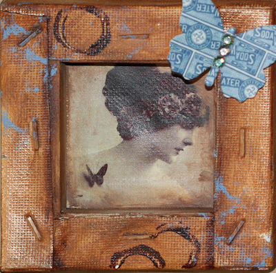
A bow and crystal finishes off the bottom of the altered frame..


inside the frame is a collage clip of Maria and baby Jesus. The edges pf the frame I embossed using zing embossing powder in brown. I loved how the little granules spilled over onto the glass and embossed that as well.


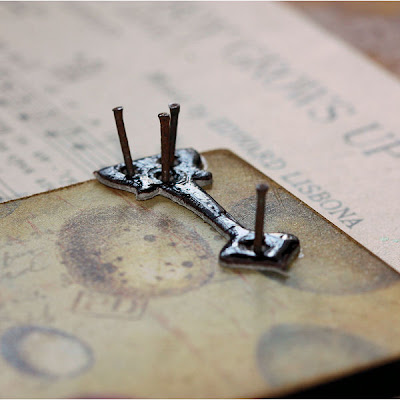
the grungeboard hinges were added to the sides of the cross not visible on the top picture. they were done a while ago, never used and found there way into my TH box. the rusty nails are from our farm shed ...where i find some of my favourite things to use in my projects.
The top of the frame is decorated with a grungeboard crown, coloured with Distress ink and Distress stickles to represent the King of Kings and finished off with diamantes. Three flat backed pearls adds the last finishing touches. A simple project but one with meaning and I loved just playing..having quiet time and reflecting once again on the true meaning of life!

perfect pearl class.


this is one of the cards we will be doing on Saturday in the perfect pearl class at sweet scrappins. if you still haven't booked your seat get a move on so you don't miss out!
don't you just love that 7Gypsies patterned paper on the left...the stamp is a PSX one and no longer available...
i hope i feel better on Saturday..it's day four that i am in bed (a first for me in my life) with double ear infection and flu! i feel awful and in need of serious playtime - having the withdrawal symptoms...hope you are having a better time than i am..

circle of friends layout.

This week's layout was a quick one but one i loved making. The top part of the layout features 5 jumbo portrait photos slightly trimmed down and matted once. you can always add a 6Th photo instead of such a large journaling block. the bottom of the layout features 4" circles cut from patterned paper. some of the circle are sewn around the edges with different coloured threads. to complete the look i added loads of diamantes - i simply dropped them onto the layout and adhered them as they fell naturally. then a few 97% 7Gypsies sticker quotes
and there you have it.

i used complimenting coloured thread to sew around the edges of the circles


and a favourite quote from the Gypsies...
friends will help you move
real friends help you move bodies"

food for the soul.

so on Monday i got to do this...
food for the soul - creating - playing with friends.
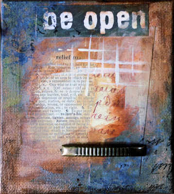
a set of five mini canvases painted and altered and stamped and all the things i love.
it included some stunning papers, book paper (my all time favourite) and some
of my favourite colours.

canvas with some of the details of artchix studio collage images, patterned paper and stamping. i am still in the process of adding some stuff, which may or may not include old rusted keys and wire...

amazing colour and texture...

one of my favourites....orange, burnt umber and brown combined with a dollop of copper on top for some shine. i loved everything about this and had a really good time - much needed to just relax and get away from the dust of everyday...
thanks to my talented friend...

easter egg layout.

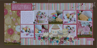
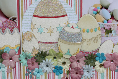
this is my Easter egg inspired layout. the chipboard Easter eggs are from enmarc. i decorated these using smooch spritz, smooch ink, glitter glue and dimensional glaze. i first sprayed the eggs in a pearl smooch spritz and then painted them with the smooch ink.
layers of glitter added here and there in different colours adds some sparkle. and dimensional glaze seals in the colours on some of the eggs.
i used the photos to create the base of my layout, and then added the grouping of eggs and flowers together at the bottom to form a central focal point. I haven't used flowers in ages and loved using them on this layout. I grouped the flowers together and added different coloured diamantes in different sizes to the centres. afterwards i also added some rub-on flowers in between as a finishing touch.

i loved using the smooch ink to add the colour to the chipboard eggs. i used 5 different colours of smooch to get the colour effect in colours silver, gold, pool, snickerdoodle and red. i used star dust stickles to soften the colours a bit and add the sparkle.
try and spot the Easter bunny hiding in the grass! These little bunnies are stickers found in the Easter egg wrappings bought from woolies....too cute and very usable.

not about the eggs.

Easter weekend is around the corner and the shops are filled with gorgeous displays of colourful eggs. Delicious master pieces to delight old and young....my favourite goodies are those from Woolies. these photos of a recycled project i did 2 years ago was the inspiration behind a themed layout i did yesterday. I am quite pleased with the outcome of the layout that i will share later - all i can say is a lot of glitterglue, smooch spray and smooch ink as well as dimensional glaze was involved.... But for now here's a little bit more about this project.
I got a small bucket (clean and new) from our local KFC (Kentucky Fried Chicken) and yes the guy totally thought i was nuts! I then decorated the bucket with patterned papers decoupaged to the outside. The top rim was decorated using Making Memories flowers in colours to match.
the bucket was filled with colourful eggs bought from Woolies...

inside the bucket with all the eggs...are some beautiful silver and cream threads as well as tissue paper to fill the bottom of the bucket at least. with photo shoots there's a lot of trickery going on...who would be able to fill an entire bucket like this with eggs - it would after all take up your entire budget for the whole shoot! apart from the obvious altered arts, and scrapbooking and photography, these kind of projects are one of my favourites. to recycle every day, all purpose goodies into new things meaningful and practical with an artistic flair! hope you feel inspired.

moo card.

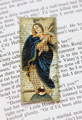
Hayley from our stamping group recently hosted a sacred heart moo card swap. This is my card. I used an image found on the web (sorry can't find my credit reference) and printed it out onto Epson's Photo Quality Paper. I love the look this paper gives images - the colours are amazingly bold and bright. it gives it a luxurious look and feel with crisp images!

I used a gold pigment ink to add some colour around the edges.

I stamped a Tim Holtz text image right across the moo card using black Stazon ink. To finish off my card I added a single diamante to the bottom of the card.
The title is "La Virgen" referencing Mary holding baby Jesus!

L is for Life layout.

don't you just love the new 7Gypsies Avignon range of papers...well at least the one I could lay my hands on....the text in black and white! used above. This layout was inspired by Jennifer McGuire (oh so talented) - she used machine sewing to link her photos together. I used a couple of old photos from childhood...The photos are linked with hand sewn stitches in grey. To create some uniformity I matted all the square photos onto grey card stock. The tiny hearts were stamped in Versafine ink and cut out, then adhered to the layout and finished off with a knot tied in the thread.

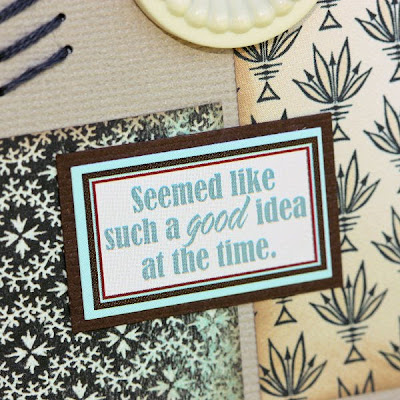
to compliment the layout i used a 7Gypsies 97% sticker sheet - L if for Life! their quotes are hilarious and the one above is so fitting for my life so far! can you relate?

supplies: Cardstock Coredinations, Prism, Bazzill Basics & Fabscraps. Patterned paper 7Gypsies & Jenni Bowlin. Stickers 7Gypsies. Stamps PSX. Ink Versafine. Buttons Jenni Bowlin Studio.

understand me.

The road to happiness lies in two simple principles;
find what interests you and that you can do well,
and put your whole soul into it –
every bit of energy and ambition
and natural ability you have.
John D. Rockefeller

perfectly pearly class.

here's a sneak peak at one of the perfect pearl class projects scheduled for the 27th March
Contact Carla if you are interested in joining us for the fun and to learn some new and different applications for this versatile product.

resist layout.

apart from the invisibles paper which really is all about resistance, we added some more of our own resist techniques to this layout this week. I love the colour combination of yellow/orange and pink - quite unusual but striking in real life. the silver on the layout is silver leafing. the strip on the side is a piece of double sided tape and the silver leafing sheets placed directly on top of that and flattened with my fingers for a nice smooth effect. you can use a soft paintbrush...but fingers work just as well. the same was done on the circle on the left but this time i used an ordinary glue stick as adhesive. as part of the accents I used a print out of a chandelier and punched it into a circle, then added a layer of dimensional glaze. let me know what you think...
as part of my embellishments i even got to use some of my old (really old) stash...see those little acrylic circles on the pink strip - they are from KI Memories and must be about 5 years old. but they worked perfectly on this layout

invisibles + distress ink.

This week's layout features the left over piece of invisibles paper from the layout about 2 weeks ago where we used only a small strip. I paired the invisibles paper with Distress ink, embossing, resist and silver leafing to create a bright and happy layout. It is all pink and yellow and orange with some silver to add sparkle, and features photos from Kathi's birthday. i really love how it turned out - so much texture and pattern...

Popular Posts

Like us on Facebook

Flickr Images